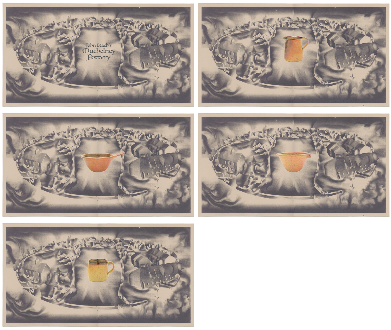
Muchelney Pottery
Web Promotional Assets
Set against the landscape of its home in Somerset, Muchelney is the home of a working pottery established in 1965 by John Leach and his wife Lizzie. John continued the family tradition that his grandfather Bernard Leach, widely considered the most important and influential artist-potter of the 20th century started. Muchelney Pottery ceramics can be described as having “tactile forms robustly made with strong shapes and fire-licked decoration.” I resonated with the values they held in craftsmanship and producing work with functionality, so this made me want to work with them.
A priority for me in creating these assets was to really connect the pottery’s ethos of craftsmanship and materiality. Just as Muchelney’s ceramics reflected their craft, I wanted the assets I produced for them to reflect this shared ethos. Taking direct reference from the architecture of the pottery itself, I went about producing physical carvings from chalk that I could photograph and integrate into the image. Placed importance was to create a scene that reflected the pottery’s building layout and geography, but to also act as an abstract representation. I wanted the processes in which I created the artwork to reflect the nature of the sculptural forms of their products
Having approached Muchelney, I pitched the idea of producing designed, illustrated, then screen-printed assets that could be utilised in a promotional capacity through web, social or print formats to frame their product range as a working pottery in the best light. This is an ongoing project.
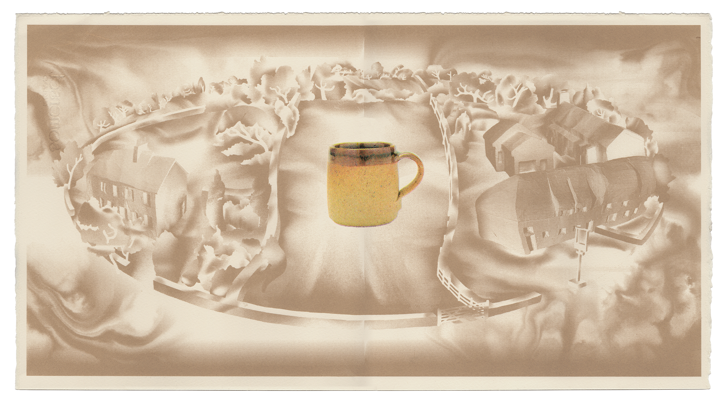
CERAMIC CMYK PROOFS
Producing these printed assets, I wanted to bring a level of craft to the prints that mirrored the craftsmanship taken in producing Muchelney ceramics. My attitude going in was to endorse the spirit of craftsmanship. As a matter of principle and as loyalty to my craft, I thought it important that the entire asset base should be printed, from the artwork to the advertised product. Differentiating between the artwork and the product range was an important component of making the final digitised image work, especially given the digitisation of tactile creations. For the ceramic range, I used a CMYK channel separation as output.
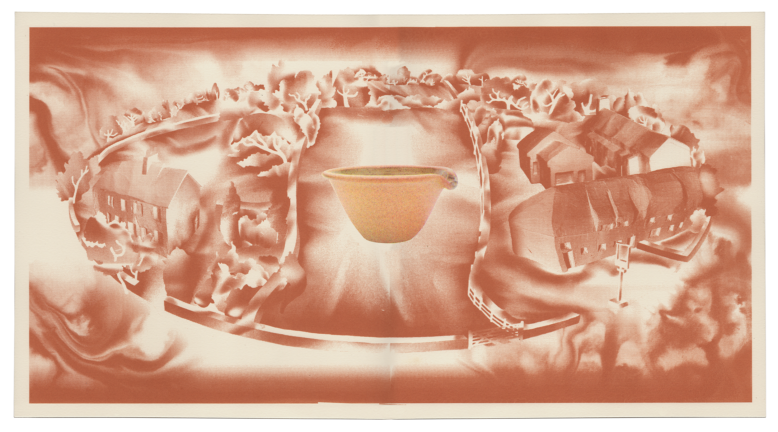
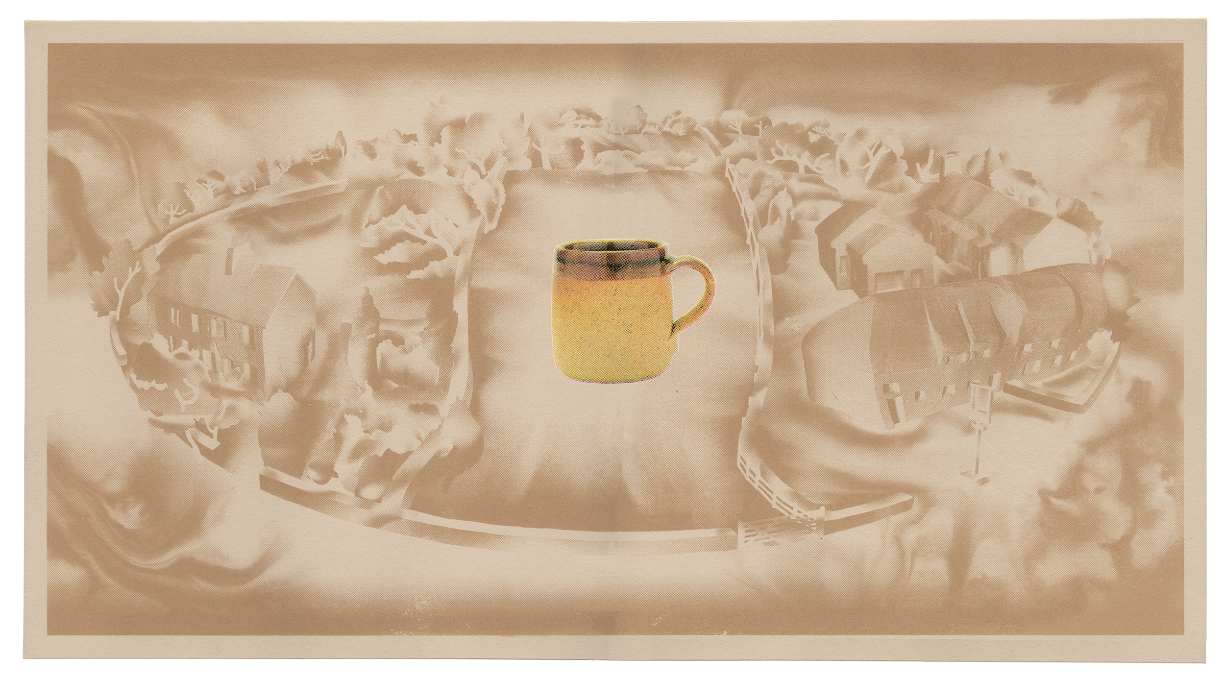
SPOT COLOUR PROOF OPTIONS
A series of spot colour proofs of the final background artwork, I provided Muchelney with a number of interchangeable colour options. I’m proud of the assets that were created and I think they accurately reflect the value set of both Muchelney and of myself as an artist. As a matter of importance though, I strove to make sure that the ceramics sat front and centre. I feel that the muted choice of spot colours for the background artwork achieved this.


